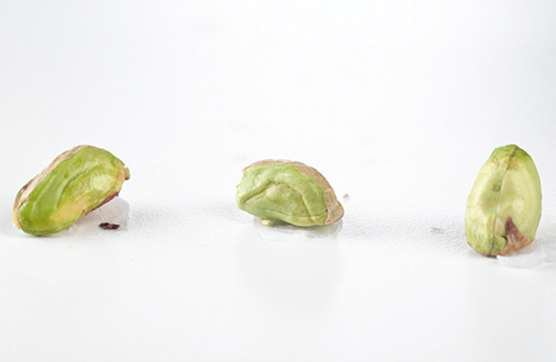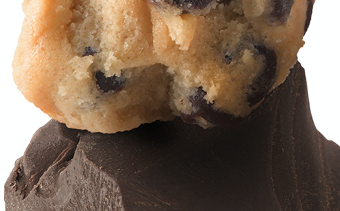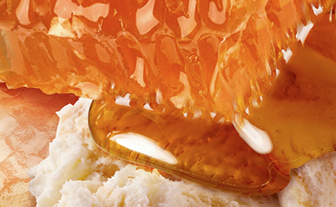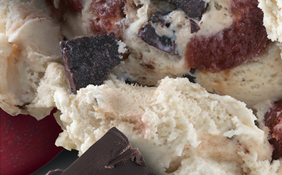
ENHANCING THE SENSES
A Case Study | Ben
&
Jerry's
For the beloved Vermont ice cream that turned “Cherry Garcia” and “Chunky Monkey” into household names, inventiveness takes on a whole new meaning—and is as crucial to brand recognition as quality and deliciousness.
We’ll show you how Lyon Visuals expertly applied retouch, compositing, and 3D modeling to create the deepest sensory experience of Ben & Jerry’s rebrand.
Here’s a little secret: Photography can only achieve so much.
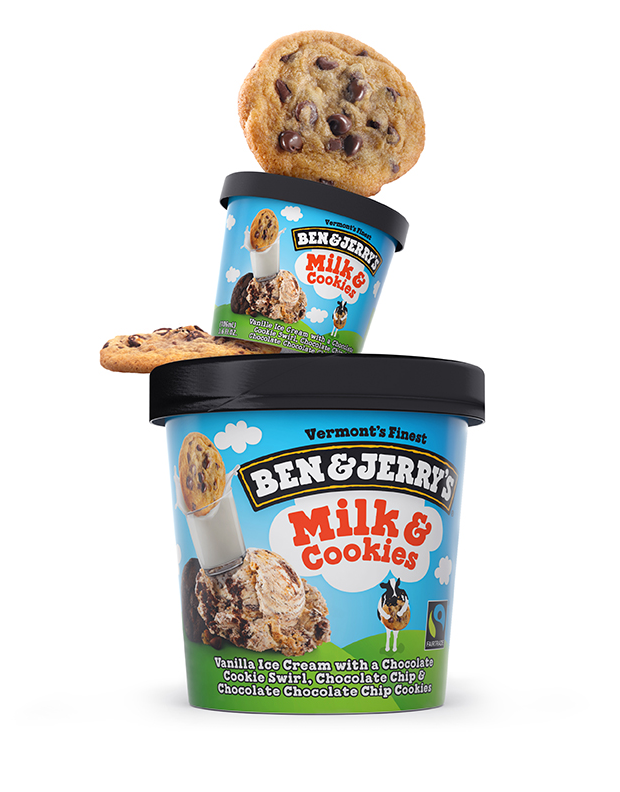
Detailed retouch was key for the brand’s package redesign. We adapted every creamy, gooey, crunchy, or otherwise irresistible pixel to the new designs, bringing precision and perfection to the agency’s overall vision.
The individual photographs came with some unavoidable inconsistencies and flaws. Such is the nature of food photography when it’s working alone.
Good news: Photographs can be perfected.
Sample of Original Photographs, before compositing + retouching
We took these inconsistencies and provided a natural visual flow between images that needed to flow …
… and a fanatical consistency among the images that needed to shout from the shelves.
The former involved incorporating precise shading and light and shadow. The latter required sharpening the details so the other visual elements could step out of the way.
Speaking of details...
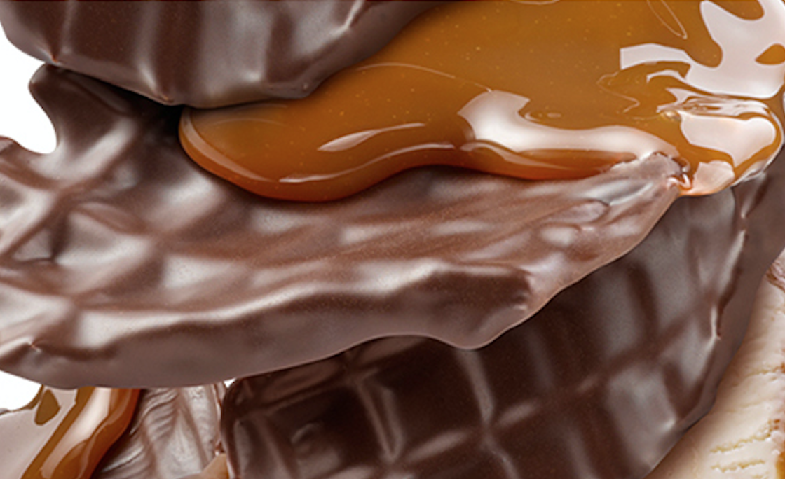
Sometimes straightforward retouch won’t cut the mustard—or, in this case, the honey and caramel. What if the original designs just can’t convey the best possible look? We create it.
Sure, these images would still make you hungry if you didn’t see the honey dripping or the caramel oozing.
But we want them to make you drool.
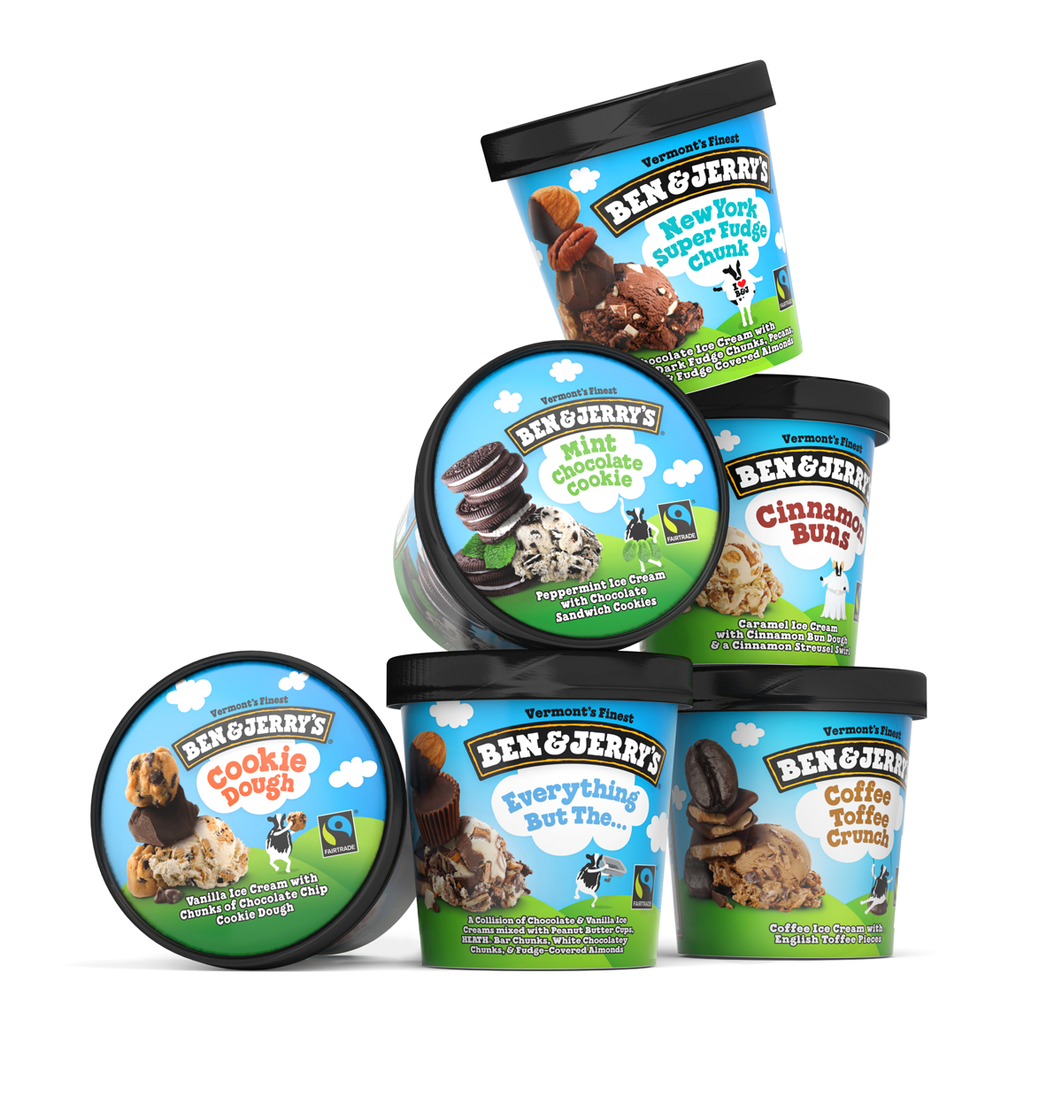
What if you have images that really need to look like they were photographed together—but they weren’t?
That’s when we composite visuals together to make the final effect look like it was literally the perfect shot. A camera can’t do this, but we won’t tell if you won’t.
With no one image visually competing with the others, you can focus on them individually…
...even if you secretly want them all.
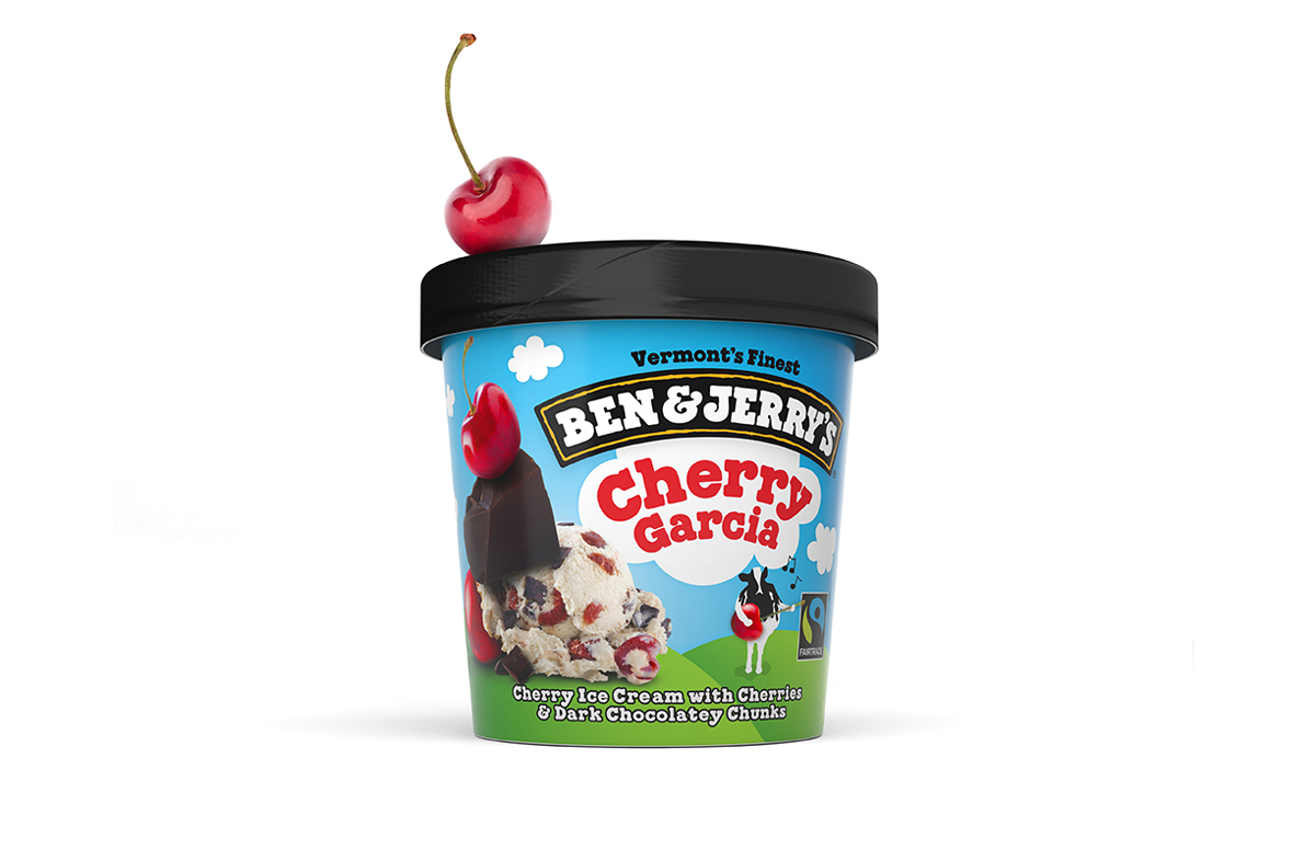
The more similar two things are, the more their differences stand out.
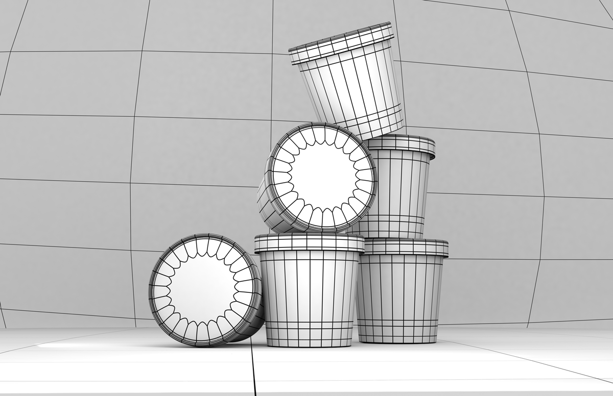
Once we made the visuals pop on the ice cream cartons, it was time to 3D model and render them to press and web—so they could also jump off the page and screen.


